Sonntag, 22. Oktober 2017

Setups for the week ahead 23.10.-27.10.17

EUR vs USD

Mixed signal.

Weekly chart of EUR vs USD
EUR vs USD W1
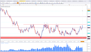
This is the weekly chart of EUR vs USD. Price was not able to violate support, nor was price able to break the top of the Bullish Engulfing Pattern. Last week closed as an Inside Candle. Price is indecisive at a level of interest. Personally I would like to see price move south to test the previous range level (black horizontal line). But we do not always get what we want. As traders we have to work with what we see. And that is currently Indecisive at support. As long support holds, treat support as support. I do not need to be in a trade, so I am fine waiting another week or two for a good setup to trade. A look at the Dollar Index will help me in the decision making process.

EUR vs CAD

Bullish bias for the week.

Weekly chart of EUR vs CAD
EUR vs CAD W1
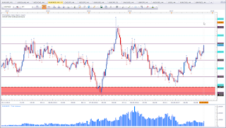
This is the weekly chart of EUR vs CAD. I was talking about this asset the previous week (see here) and the price only took of last week unfortunately without me. Having established a bullish bias does not necessarily mean I am going to buy this asset. It also means I am going to avoid to sell this asset. Having a bias reduces the vast amout of trading opportunities, which may prove to be essential.

CAD vs JPY

Mixed signal.

Weekly chart of CAD vs JPY
CAD vs JPY W1
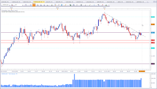
This is the weekly chart of CAD vs JPY. Price formed the 3rd Indecision Candle in a row at a level of interest. The last candle could classify as a High Wave Candle. As you can see by the black dotted lines, price failed to violate the first Indecision Candle (on a weekly basis).

AUD vs NZD

Mixed signal.

Weekly chart of AUD vs NZD
AUD vs NZD W1
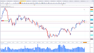
This is the weekly chart of AUD vs NZD. Basically the structure is bullish. If price had not been this close to the resistance level marked with the red line, I'd have labeled this asset as bullish. Price is making higher highs and higher lows. This is the classic definition of a bullish trend. Price is now approaching about the fourth time this level. Either we'll see a violation or a bounce. Only time will tell. This asset is very interesting. Keep an eye on this one.

EUR vs NZD

Mixed signal.

Weekly chart of EUR vs NZD
EUR vs NZD W1
This is the weekly chart of EUR vs NZD. This asset is quite interesting. Notice how last week did violate the previous Pinbar. That was a nice beatish setup. But it failed (mainly because of NZD news). If you have not read my article about Pinbars, you can find it here. This asset shows the classi signs of a bullish trend i.e. a series of higher highs and higher lows. This basically this puts my bias in favour of the bulls, hence I'll avoid shorting this asset. But price is approaching a level of interest and we may see a reaction here.

USDOLLAR

Mixed signal.

Weekly chart of USDOLLAR
USDOLLAR W1
This is the FXCM Dollar Index. The question that arises now is, did we form a lower high? Price was not able to violate the 12 level and formed a Piercing Pattern at a previous congestion area. At this moment, I don't give the Piercing Pattern (bullish formation) much value. If we are going to see USD strength, price has to break and close above the 12 level. Below the 12 level I tend to be neutral or bearish. Unfortunately this asset is not helpful to evaluate EUR vs USD. I am not rather neutral to bearish this asset.

DAX 30

Mixed singal.

Weekly chart of DAX 30
DAX 30 W1
This is the weekly chart of DAX 30 (FXCM Ger30). Price did form the second Doji in a row. Hence this asset did catch my attention. The trend is bullish, so I am not keen on counter trend trading this asset. But I'll keep a keen eye on this for potential setups. A close below the Doji would be a bearish signal.

EUR vs JPY

Bullish bias for the week.

Weekly chart of EUR vs JPY
EUR vs JPY W1
This is the weekly chart of EUR vs JPY. Last week I did talk about this asset and mentioned I'd like to see a close above the two Indecision Candles. I also talked about the Tombstone Doji. (click here).
Last week candle engulfs the two previous candles. And this happens at a level of interest in a bullish trend. This puts my bias in favour of the bulls. But price is very close at the swing high which can act as resistance.

Copper

Bearish bias for the week.

Weekly chart of Copper
Copper W1

This is the weekly chart of Copper. Price formed a Shooting Star at a previous trouble area and the swing high. This puts my bias in favour of the bears.

Hope you enjoy my weekly analysis. If you have any queations or feedback please leave them in the comments section below.

Happy trading,
TT

Donnerstag, 19. Oktober 2017

Talking about trends Part 2

If you have not read Part 1, I'd strongly suggest to read part 1 (click here), is this is a continuation of the first part.

We have already established that the financial markets are fractal by nature. Now let is elaborate on this by looking at some live charts.

Five minute charte of EUR vs JPY
EUR vs JPY m5
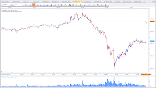
This is the 5 minute chart of EUR vs JPY. We have a shift of trend on on this timeframe. Prevoiusly price was making higher highs and higher lows and all the sudden price broke the previous low and made a strong move down. Some may say this is a down trend. Let's have a look at the 1 minute chart.

1 minute chart of EUR vs JPY
EUR vs JPY m1
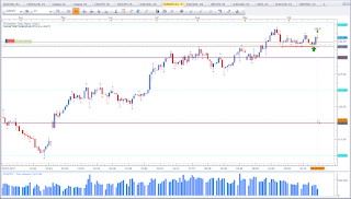
This is the 1 minute chart of EUR vs JPY. We have two timeframes showing a lower low and possibly a lower high.

We already know that we cannot really talk about trends without specifying the timeframe. The assumption of a bearish trend in development may be true on the lower timeframes seen above. But what about the higher timeframe such as H4 or Daily?

H4 chart of EUR vs JPY
EUR vs JPY H4

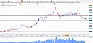
This is the H4 chart of EUR vs JPY. What we thought might be a trend on H4 may only be a reaction on the higher timeframe. 

Daily chart of EUR vs JPY
EUR vs JPY D1
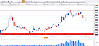
This is the daily chart of EUR vs JPY. Price is making higher highs and higher lows.

While we assume a bearish trend on the smaller timeframe, the higher timeframe shows us a bullish trend. Some traders who were lucky to take the trade from lower prices might have gotten out because they got scared by looking at the smaller timeframes. This is not wrong. This is one way to manage the trade. It is one form of risk- and money management (clicke here for more about risk- and money management). 

The trend on the daily did not get invalidated, so I must assume the trend continues. And I can keep my position open and still keep an eye for warning signs on a smaller timeframe such as H4. The story is told on H4, that's why I maintain a part of my position. And now I am scratching on a new aspect that I want to talk about in "Talking a little bit about risk management". (If you have not read my article "Talking a little bit about risk management part 1" click here).

I hope you enjoy reading my articles. If you have any questions of would like to give me feedback, please leave them in the comments section below.

Happy trading,
Oezy

Mittwoch, 18. Oktober 2017

Talking about Trends part 1

Today I want to talk about trends. We all did hear the famous line “The trend is your friend.” Well, this line is so true. But this simple sentence leads to a lot of confusion. So let’s delve into this matter.

But let me confuse you a little bit more. I promise I will clean up the mess. What is a trend? Some see three bullish candles in a row and call it a trend. Then there are traders who put a Moving Average on the chart and say if price is above that line, the trend is bullish and below that line for bearish. Then there are trades that look at an oscillator and say if price is above the 0-line, the trend is bullish and below the 0-line for bearish. I am not going to say this is wrong, as there are many different ways to approach a trade. But I want to state, that there is a lot of information missing in this approach. Others talk about higher highs and higher lows, which is about the classic definition of a trend. While I tend to agree with the latter one, there is still information missing. Talking about trend requires more than saying “the trend is bullish” or “the trend is bearish”.

Let’s talk about fractals. The markets are fractal by nature. And I am not talking about the Bill Williams Fractal Indicator. Not yet that is. So what are fractals? Did anyone of you ask yourself this question? Now we are getting into Chaos Theory. No worries, I am not going to lecture you about the theory of complex systems. When we think of Chaos we have a picture in mind where there is no order at all. Most of us do not know that Chaos is a higher form of order (complex and dynamic). We are already talking about fractals. Fractals are self repeating patterns. While each single pattern looks the same, each single pattern is individual. Snowflakes are very a very good example to describe the fractal nature. Each individual snowflake looks like the other. But in detail they are all unique. And this applies to the financial markets as well. I can post any chart and hide the timeframe. No one would be able to tell what timeframe it is. This is the fractal nature of the markets. And now we are getting closer to talk about trends.

Above I gave a classic definition of trends. We are looking for a series of higher highs and higher lows for a bullish trend. A bearish trend therefore would come with a series of lower lows and lower highs. But since markets are fractal by nature, we need to define the timeframe. Let me give you a fictive example where we are looking at the daily timeframe and we see a series of higher highs and higher lows; hence we have a bullish trend on the daily timeframe. But this may merely be a pullback on the weekly timeframe, where we have a series of lower lows and lower highs. Or a series of same level highs and same level lows, which would define a ranging market.

Let me illustrate this with some charts. I will not go into details at this time as that would take too much time and space. For now we’ll take a general view of the market flow.

H4 Chart of USD vs CAD
USD vs CAD H4

This is the 4 Hour chart of USD vs CAD showing us a series of higher highs and higher lows. This is bullish.

Daily chart of USD vs CAD
USD vs CAD D1
This is the daily chart of USD vs CAD showing us a series of lower lows and lower highs. This is bearish.

Weekly chart of USD vs CAD
USD vs CAD W1
This is the weekly chart of USD vs CAD showing us a series of higher highs and higher lows. Recently we are seeing a potential shift of trend (more about this in a later post).

Monthly chart of USD vs CAD
USD vs CAD M1
This is the monthly chart of USD vs CAD showing us a series of higher highs and higher lows. This is bullish.

As you can see by the charts, it is not suffice to say the trend is bullish. We need to refer to the trend on a specific timeframe. The charts clearly show that a pullback on one timeframe can be a trend on another timeframe. And this goes on and on. We have a bullish trend on the monthly timeframe while the daily is bearish. The weekly already formed a lower low and a lower high, which is basically bearish but the monthly is in a bullish trend.

I will get deeper in the topic of trends in future posts. I hope you enjoyed this article and found value in reading it. If you have any questions and feedback/suggestions please leave them in the comments section below.

Happy trading,
TT

Sonntag, 15. Oktober 2017

Setups for the week 16.10.-20.10.17

EUR vs USD

Bullish bias for the week.

Weekly chart of EUR vs USD
EUR vs USD

This is the weekly chart of EUR vs USD. This asset is in the process of a trend shift. Price did break out of the range, I am expecting a pullback. Price did pull back and formed a bullish reversal pattern at a level of interest. We have a Bullish Engulfing Pattern at support. This signal is a bullish signal. So my bias is bullish. Ideally we had seen a pullback to the black line and get the bullish reversal signal at that level. But we do not always get what we want. We have a bullish signal at a level of interest. I'll be looking for long opportunities. However, I still favour a move to the black line. That means I am not eager to trade this asset long. I am fine letting a trade pass. If I get a suitable setup, I'll happily take the trade.

CAD vs JPY

Mixed signal.
Weekly chart of CAD vs JPY
CAD vs JPY

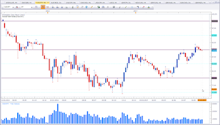
This is the weekly chart of CAD vs JPY. Two Indecisin Candles in a row catch my attention. Price is at a level of interest. So I stay alert with my neutral bias. We may seem some interesting moves here.

NZD vs JPY

Bullish bias for the week.

Weekly chart of NZD vs JPY
NZD vs JPY

This is the weekly chart of NZD vs JPY. Price formed an Indecision Candle with a rather long lower wick showing a rejection. This candle could pass as a Hammer. The rejection did happen at a level of interest. This puts my bias in favour of the bulls. 

EUR vs NZD

Bearish bias for the week.

Weekly chart of EUR vs NZD
EUR vs NZD

This is the weekly chart of EUR vs NZD. Last week failed to violate the high and formed a Shooting Star. This puts my bias in favour of the bears. 

USDOLLAR

Bearish bias for the week.

Weekly chart of USDOLLAR
USDOLLAR

This is the weekly chart of FXCM USDOLLAR. FXCM has it's very own USD Index, which is slighlty different than the classic Dollar Index. However, the FXCM Dollar Index is useful for the analysis nevertheless. Price failed to violate the high I was talking about last week (see here) and formed a Bearish Engulfing Pattern at the 12 level. This puts my bias in favour of the bears and adds more bullish fuel to my thoughts about EUR vs USD. 

EUR vs JPY

Mixed signal for the week.

Weekly chart of EUR vs JPY
EUR vs JPY

This is the weekly chart of EUR vs JPY. We have two Inside Candels. Last week did close as a Tombstone Doji. In the context of the current market structure we could talk about an Inverted Hammer, which basically is a bullish reversal pattern. I personally favour to see a weekly close above the two Indecision Candles before I talk about a bullish bias. If I see a setup at the red horiziontal line, I am very inclined to take the trade.

AUD vs USD

Bullish bias for the week.

Weekly chart of AUD vs USD
AUD vs USD

This is the weekly chart of AUD vs USD. Price did form a Bullish Engulfing Pattern at the previous range resistance level, which should act as support now. The Bullish Engulfing Pattern at Support puts my bias in favour of the bulls. 

EUR vs AUD

Bearish bias for the week.

Weekly chart of EUR vs AUD
EUR vs AUD

This is the weekly chart of EUR vs AUD. Price failed the third time to violate the swing high. Last week did form a Rejection Candle. This puts my bias in favour of the bears. A conservative approach would be to wait for the violation of the trendline. 

NZD vs USD

Bullish bias for the week.
Weekly chart of NZD vs USD
NZD vs USD
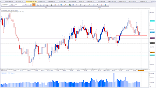
This is the weekly chart of NZD vs USD. Price formed a Piercing Pattern at a level of interest. This and the bearish bias for USD puts my bias in favour of the bulls.

AUD vs CAD

Bullish bias for the week.
Weekly chart of AUD vs CAD
AUD vs CAD

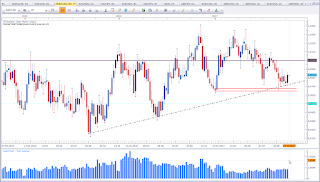
This is the weekly chart of AUD vs CAD. Price formed a Bullish Engulfing Pattern at a confluence support level (see the trendline and the two parallel red lines. This puts my bias in favour of the bulls. However, take note that price is still inside the big bearish mother candle.

Cross Currency Analysis

The two assets that stick out are AUD and USD. AUD presents strength throughout the pairs and USD is weak. This makes AUD vs USD an interesting asset to trade.

Mittwoch, 11. Oktober 2017

Talking a litle bit about Risk management Part 1

Recent conversation made me want to talk about risk management. At this point I need to address that risk management comes with money management (for more about this see here). But today I want to focus on risk management alone. 

There are many forms of risk management. Let me briefly describe what risk management is. Risk management is the process to identify (and in many cases the “attempt” to control) threats to a company or to assets of a company. While big companies have (more or less strict) regulations about risk management, we retail traders do not have any regulations on risk management. Let me now transfer this to the retail trader.

Risk management basically covers the decision process where to exit a position (if the decision is in favour of taking the respective position). Stops are a tool to help close a position. There are different forms of stops, such as hard stops, trailing stops, and mental stops. Each of them have their very own advantages and disadvantages. Traders who use mental stops are afraid that the broker (market maker) will influence the price to trigger their stops. If there is no stop, the market maker won’t be able to trigger their stops. Hence their trade is safe from getting hunted, while those traders that use hard stops can become victim of this practice of stop hunting. (Click here for more about stop hunting)

Keeping a mental stop however requires guts of steel. Traders who use mental stops need to have a strong mind, because humans are fast in changing their minds. The factor fear and greed make us do things that we would not do under normal conditions. Have you ever looked at a chart and then asked yourself “How could I have done this?” or “Why in the world did I exit the trade here?”

If you ask me how I manage risk, the answer is simple. I never take a position without a stop. I know very well, that there are many professionals making a big chunk of money by hunting stops. But I rather get stopped out than give the market a chance to take more of my money. I just have to locate the levels and be patient. There is no guarantee in trading. We will all have losses. We just need to be wise with our stops. My stops are always technical. There is no minimum or maximum distance requirement for my trades. If my money management allows me to take the trade and use the technical sound stop, I take the trade. If not, I wait for the next opportunity.

There are traders who like to keep their stops very close to their entries. This is a sound strategy. The downside of this strategy is the chance of getting stopped out. But this should not bother you at all, as you did decide before your entry that you do not want to be part of the move if price reaches a certain level. There should not be hard feelings about getting stopped out. (read also the following articles Do you mind a losing trade?, Ist ein Verlust-Trade schlecht?)

I like to incorporate market structure in my decision process. My stops always depend on the type of trade and the type of entry. Intraday trades are managed differently, while swing and or position trades are managed differently. Intraday trades follow a tailing stop, while swing and position trades are closed manually after having put the stop to breakeven. It is essential that you know before you enter what type of trade you are planning to trade.
I hope you enjoy my post. If you have any questions or suggestions please leave them in the comments section below.

Happy trading,
TT

Montag, 9. Oktober 2017

Setups for the week ahead 09.10. - 13.10.17

EUR vs USD

Mixed signal.

Weekly chart of EUR vs USD

This is the weekly chart of EUR vs USD. The previous week I did mention the early signs of a potential correction. Price failed to violate a potential support level. I still want to see a test of the range resistance level marked with the black horizontal line. But currently price is at a support level. Above this level my bias is neutral until I see signs to to reevaluate.

If USDOLLAR strengths remains, we may see a test of the black horizontal line or even lower prices. We need to keep an eye on the USD Index for more clues.

EUR vs CAD

Bullish bias for the week

Weekly chart of EUR vs CAD

This is the weekly chart of EUR vs CAD. My bias has not changed from last week. Same applies for price though. Above 1,45 my bias remains bullish.

AUD vs NZD

Bullish bias for the week.

Weekly chart of AUD vs NZD

This is the weekly chart of AUD vs NZD. Last week formed a Morning Star Pattern, which is a bullish reversal pattern. I would have favoured a close above 1,10 but we do not always get what we wish. Price did break a previous swing high, retraced and formed a reversal pattern at a level of interest. And this puts my bias in favour of the bulls.

USDOLLAR

Mixed signal.

Weekly chart of USDOLLAR

This is the weekly chart of the FXCM USD Index. I did label this asset as neutral because we may see a reaction. The close above the trendline and above the 12 level is a bullish sign. However, price failed to close above the Shooting Star Candle with the Fractal on top of it. The weekly close will shed more light. I see a chance for price to rise to 12,25. This would be in line with my thoughts about other USD pairs such as the EUR vs USD. Currently we have a bullish sign, but we may see a reaction. So I am not keen on trading EUR vs USD until my target levels get tested. Or I see a weekly setup that proves me wrong.

EUR vs JPY

Mixed signal.
Weekly chart of EUR vs JPY

This is the weekly chart of EUR vs JPY. Price is at an interesting level. This asset seems like it wants to test the 110 level. Currently there is no setup, but it is well worth to keep an eye on this asset.

USD vs JPY

Bearish bias for the week.

Weekly chart of USD vs JPY

This is the weekly chart of USD vs JPY. The structure looks week. This asset shows resistance to move higher. We may see a reaction. Last week closed as an Indecition Candle which could be classified as a Shooting Star. While I am not keen on trading this asset, I might look for shoting opportinties this week, beause of the fragile up move. This may be an early sing for a correction.

Copper

Bullish bias for the week.

Weekly chart of Copper

This is the weekly chart of Copper. Price formed a modified Morning Star Pattern with last week close. This is as already mentioned above a bullish reversal pattern. Ideally last week should have closed above the bearish candle. But the close is high enough to talk about a Morning Star Pattern. Price is making higher highs and higher lows, which is characteristic for a bullish trend. The Morning Star Pattern may form the higher low in this series of higher highs and higher lows.

AUD vs USD

Mixed signal.

Weekly chart of AUD vs USD

This is the weekly chart of AUD vs USD. Price is at an interesting level. It is well worth to keep an eye on this asset. As mentioned above, we need to keep an eye on USDOLLAR also to further enhance our odds. I am looking for a bounce off the range resistance level. We may however see price move deeper into the rectangle. At this moment, it is too early to talk about a setup.

I hope you enjoy my weekly analysis. If you have any questions or suggestions, please leave them in the comments section below.

Happy trading,
TT

Montag, 2. Oktober 2017

Setups for the week ahead 02.10. - 06.10.17

EUR vs CAD

Bullish bias for the week.

Weekly chart of EUR vs CAD

This is the weekly chart of EUR vs CAD. 1,45 level proves to be a significant level. Above this level I am bullish. Last week formed a Rejection Candle. If we get a weekly close beloe 1,45 the bias is void and I have to re-evaluate.

EUR vs NZD

Mixed signal.

Weekly chart of EUR vs NZD


This is the weekly chart of EUR vs NZD. I did talk about this asset last week (here). Price is at a level of interest. Last week close did form a small Bullish Engulfing Pattern. But this does not put my bias in favour of the bulls. We have another Indecision Candle, so my bias remains neutral. I have two focus levels that I'll get more interested. Either a close above 1,65 or a test of 1,60. Keep an eye on this asset, it may be worth it.

GBP vs JPY

Mixed signal.

Weekly chart of GBP vs JPY

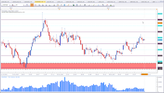
This is the weekly chart of GBP vs JPY. I did talk about this asset last week (here). The picture has not changed. I am still tempted to label this asset bearish, but it may merely be a pause in an upward move. Price may have paused to test the broken range resistance level. We'll only know after the move. For now I am am on observers mode.
AUD vs JPY

Bearis bias for the week.

Weekly chart of AUD vs JPY


This is the weekly chart of AUD vs JPY. This asset was labled as bearish last week (here). With last week close we have a Bearish Engulfing Pattern. It may still be a test of the swing high that barely got broken. But what I see is a bearish pattern. And that puts my bias in favour of the bears.

USDOLLAR

Bullish bias for the week.

Weekly chart of USDOLLAR


This is the weekly chart of FXCM USDOLLAR. Last week I did talk about this asset (here). I did mention that if we get a close above the bearish candle it will be a bullish sign. We do have a modified Morning Star Pattern which is a bullish reversal signal. This pattern puts my bias in favour of the bulls. The next obstacle is the descending trendline followed by the 12 level. I like to use this index in reference to EUR vs USD and GBP vs USD on most other USD pairs. With Dollar strength we'll see a weak EUR vs USD and GBP vs USD.

If you have any questions, please leave them in the comments section below.
Happy trading,
TT