As always, the weekly analyis is mainly designed as a journal for myself. However, views are shared publicly. This is by no means an invitation to take positions based on my views. I am no financial advisor, nor am I suggesting to trade my setups. This is merely a tool to study and understand the markets.
Coming to the setups for the week.
EUR vs USD
Bullish bias for the week.
This is EUR vs USD weekly timeframe. Price did break the resisatance level that I had an eye on. With the break and close above the red line my bias switched to bullish. Market structure suggests a test of 1,15. Do not get this wrong. This does not mean we'll see 1,15 this week, First this pair needs to clear the 1,10 level. Time and price will tell.
AUD vs NZD
Bullish bias for the week.
This is EUR vs NZD AUD vs NZD weekly timeframe. Price is showing sings of a healthy trend upwards. We have higher high and steady higher lows. Price formed a Bullish Engulfing Pattern on top of a previous resistance level which acts as support now. If the trend continues we should see a beak of the last swing high which would come in with a break and close above 1,10. I have a bullish bias, however stay alert as price is close to 1,10.
NZD vs CAD
Mixed signal.
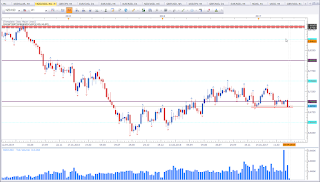
This is NZD vs CAD weekly timeframe. Price formed a Dark Cloud Cover at 0,95. This is a bearish setup. However market structure shows struggle to move lower and struggle to move higher. So I'd rather opt to stay on the sidelines until price shows me its true intentions. We have support below, that I have talked about in earlier posts (here). The lower highs suggest rather bearish pressure. And being close to the ATH (red zone above) adds up to the bearishness of the market.
GBP vs USD
Mixed signal.
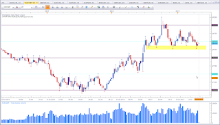
This is GBP vs USD weekly chart. Price did break above the range with a healthy bullish candle. This is bullish. But now price is testing the next resistance level. So I stay alert on the sidelines. We may see a pullback from this level. A breakout will add more bullishness. But be aware of potential bull traps. Do not jump on the break of resistance, but rather excersize patience and let the weekly close. A look at the USDOLLAR may give more insight.
USDOLLAR
Bullish bias for the week.
This is USDOLLAR weekly chart. Price formed a Doji on top of a level of interest. This pattern is a reversal pattern. Espescially if it forms at levels of interest like it does here. Price was still not able to violate the support level I highlighted last week (see here). The bullish bias on this asset would add bearishness on the GBP vs USD pair and diminish the bullishness seen on EUR vs USD. We may see a bounce off 1,10. I prefer a synthony between these three, as they have a high degree of correlatoin (i.e. EUR vs USD and GBP vs USD positive and both inverse to USDOLLAR). A close below the Doji should clear the way up to 1,15 on EUR vs USD and should come with bullishness on GBP vs USD as well. In this scenario we should see a test of the yellow zone on GBP vs USD (former ATLs).
USD vs JPY
Bullish bias for the week.
This is USD vs JPY weekly chart. Price formed a three candle reversal pattern called Morning Star. Last week formed an ideal looking Morning Star Pattern. This puts my bias in favour of the bulls. If the bias on USDOLLAR mentioned above holds true, we should see price ignore the minor resistance at 112,50 and run to 115 easily.
AUD vs JPY
Bullish bias for the week.
This is AUD vs JPY weekly chart. Price formed an ideal Monring Star Pattern. This puts my bias in favour of the bulls. Price is currently testing the minor low created December 2016.
USD vs CHF
Bullish bias for the week.
This is USD vs CHF weekly chart. Price formed a Hammer at support. This pattern puts my bias in favour of the bulls. Ideally the Hammer should have a longer wick potruding below the low of the Bullish Engulfing Pattern to the left. However, the current Hammer confirms the support level.
EUR vs GBP
Bullish bias for the week.
This is EUR vs GBP weekly chart. Price formed an Inverted Hammer at support. This puts my bias in favour of the bulls.
NZD vs USD
Mixed signal.
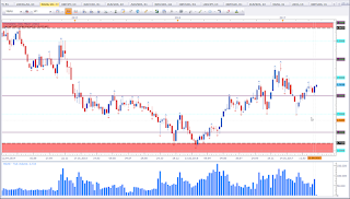
This is NZD vs USD weekly chart. It is interesting to see how this asset closed right on support. Last week engulfs the two previous bullish candles. Basically this is a bearish engulfing pattern. But to be truly considered a bearish engulfing pattern, this pattern should have formed on a high. In this case, this pattern may at max confirm the bearishness. What is of more interest is the close below the 0.70 level which proved to be relevant in June and November 2016 (see here) and again this year. Now we have a violation. However, price is still on top of support and this week close may either confirm the bearishness or not. A close below is bearish and would be in line with the overall rather USD bullishness.
NGAS
Bullish bias for the week.
This is NGAS weekly chart. Price formed a Bullish Engufling Pattern above the 3,00 level. This puts my bias in favour of the bulls.
Happy trading,
TT



Keine Kommentare:
Kommentar veröffentlichen